Hello, Alphabet!
Courage stripes, part 2
I’ve been knitting away on my sample COURAGE hat, and Mandy has been feeding yarn and swear words into our circular sock machine in the hopes that socks will come out the other end. I’ll show you our progress soon, but first I should back up and talk a bit about this colour alphabet.
Last year I started playing around with the idea of using colours to represent letters of the alphabet. This is not my original idea, and if you google “colour alphabet” you’ll find art projects and scholarly papers and all sorts of work that build on the concept.
If you were designing a colour alphabet for practical purposes, it would make sense to look at the most commonly used letters in whatever language you’re working in, and assign those to the most distinctive colours. In a psychology paper I’d have to go into detail, but for our purposes I think we can just agree that:
T = blue-ish green,
S = green-ish blue,
Q = yellow
is not a great starting point. S and T are going to get mixed up all the time and that will be confusing. On the other hand:
T = blue-ish green,
S = yellow,
Q = green-ish blue
is probably just fine. If we got rid of all the Q’s in English and replaced them with T’s, I bet we’d adapt pretty tuickly.
Anyway. That’s not what I did. Or at least, that wasn’t my only goal. I wanted to pick colours that would be easy to tell apart, of course, but I also wanted it to look nice. It turns out that distinctive and attractive are often opposites.
After some overthinking and going around in circles I decided to worry less and get started. I chose a phrase and picked colours that I thought looked good in that one particular situation.
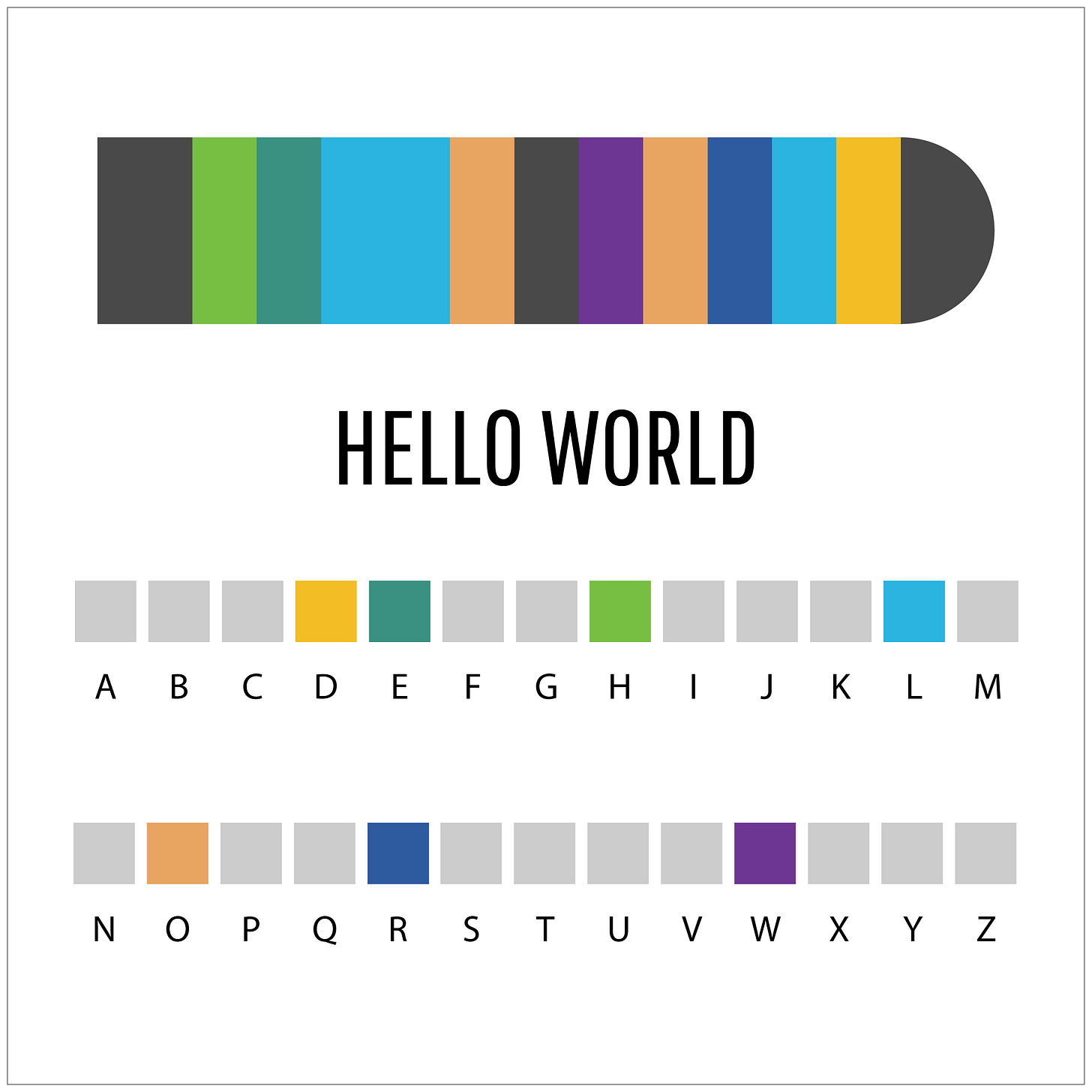
Image description below.1
My starting point was “HELLO WORLD”. If you’ve ever taken a computer programming course, you’ll recognize this as the first statement you print out to get things up and running. It felt appropriate, and took away all the pressure of coming up with the “perfect” first word.
HELLO WORLD has a few letters that are used more than once, so I had seven letters of my code. Filling in the rest of the alphabet took a bit of time and messing around.
One final limitation was it had to be colours I can dye. (Obviously.) I work with a limited set of primary colours of dye, so I can create any colours that are “between” those primaries, but some colours are out of my gamut.
In the end, the result is this:
Image description below.2
After HELLO WORLD, I had a customer request for LIVE LONG AND PROSPER, and another for LOVE IS LOVE. I also did a FIBRATIONS colourway for our local fibre fest, and a custom KNIT CITY colourway. They’re all here if you’d like to take a look.
I had been feeling like it was time for another one, but just wasn’t inspired about what to say. But COURAGE sure feels right.
Courage also looks right. One of the things about this alphabet is that by coincidence some words or phrases are beautiful and others are very, very ugly. “Ugly” is subjective but my whole business model centers around art i.e. me making subjective decisions. So I would 100% pull the plug if I hate it.
I do not hate it. I think it’s delightful.
Image description below.3
A horizontal bar that represents a sock. The sock spells out the phrase HELLO WORLD in a colour code. The legend for the colour code is below. Most of the letters are represented by pale grey instead of a colour because I hadn’t figured them out yet.
A horizontal bar that represents a hat or cowl. The sock spells out the phrase COURAGE in a colour code. The legend for the colour code is below, with a different colour for every letter. I still have never used the letter Q.
A tray holding most of a Musselburgh Hat on the needles. The rest of the ball of yarn is also on the tray. I started knitting at the E end, so at one point the hat spelled AGE and then RAGE. Now it’s OURAGE, and soon it will be COURAGE.


I have graphaesthesia (seeing letters and numbers as specific colours) and have noticed it since nursery school (I’m in my 60’s now). It’s a great spell check device. My 22 year old son has it too and we don’t always agree on what letters are what colour but I must say, mine is very alphabet different from yours! Whew!
I love hearing the almost scientific thought process that goes into your art. The planets yarn is another great example.